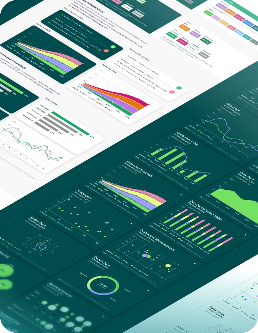
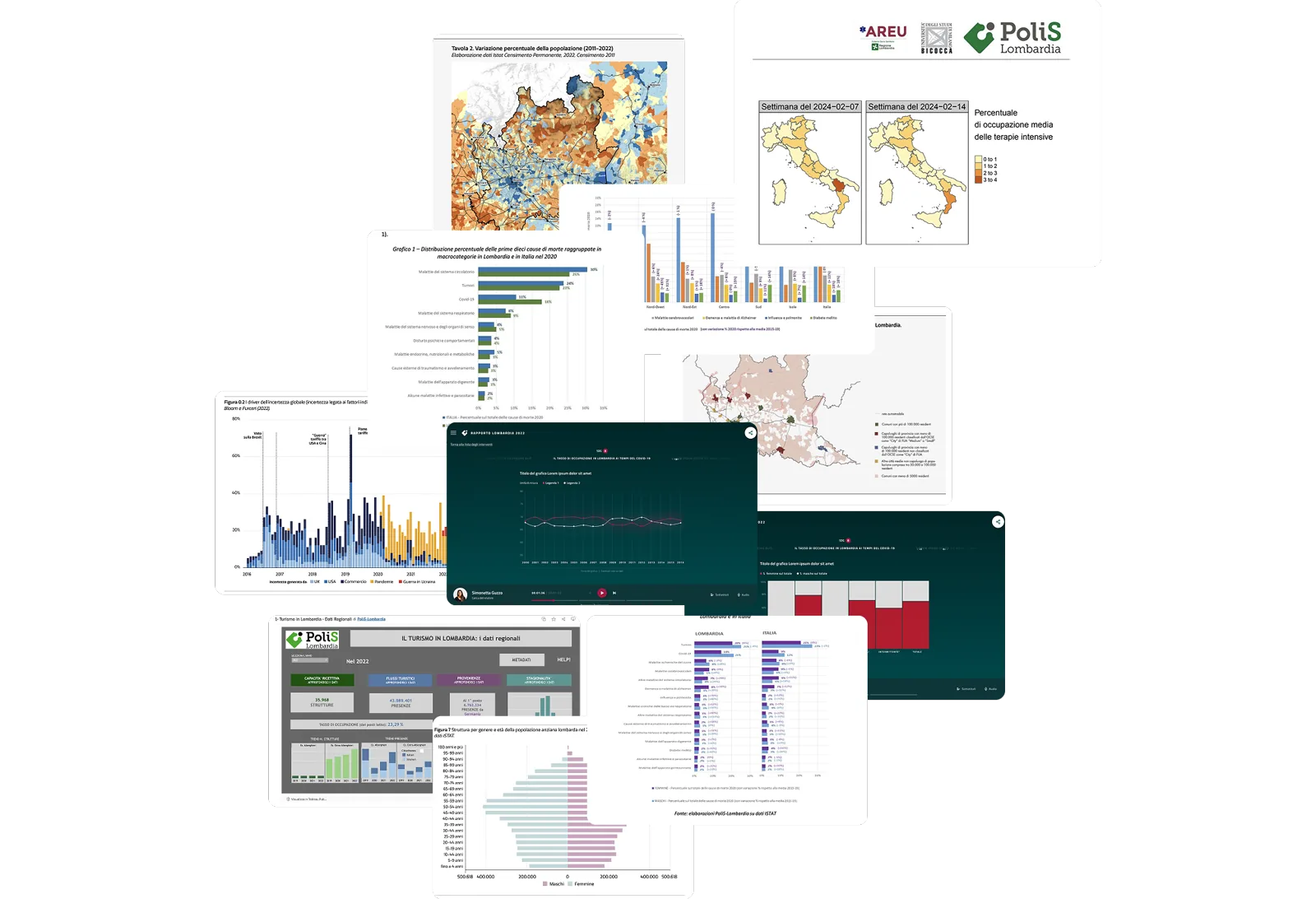
They produce charts, but every one with a different visual language. How do you transform complex data into recognisable, and accessible visual narratives across all departments?
Starting point
PoliS-Lombardia needed to standardise how they visualise highly detailed data across diverse audiences. The challenge lay both in creating a unified brand identity and in assuring the guideline's accessibility, as well as integrating this with their legacy BI tools - which have severe customisation limits.
Our approach
We addressed these challenges through a structured methodology:
Data familiarisation: conducted an in-depth analysis of the client's data visualisation practices and needs.
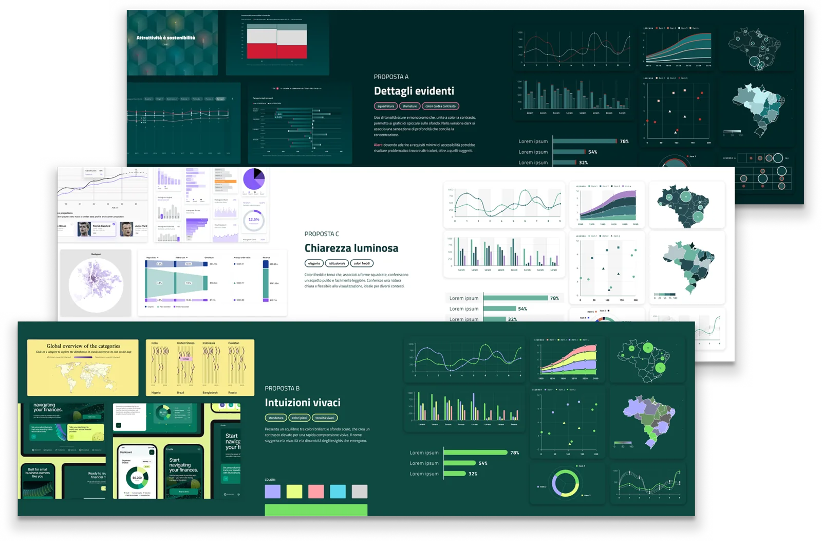
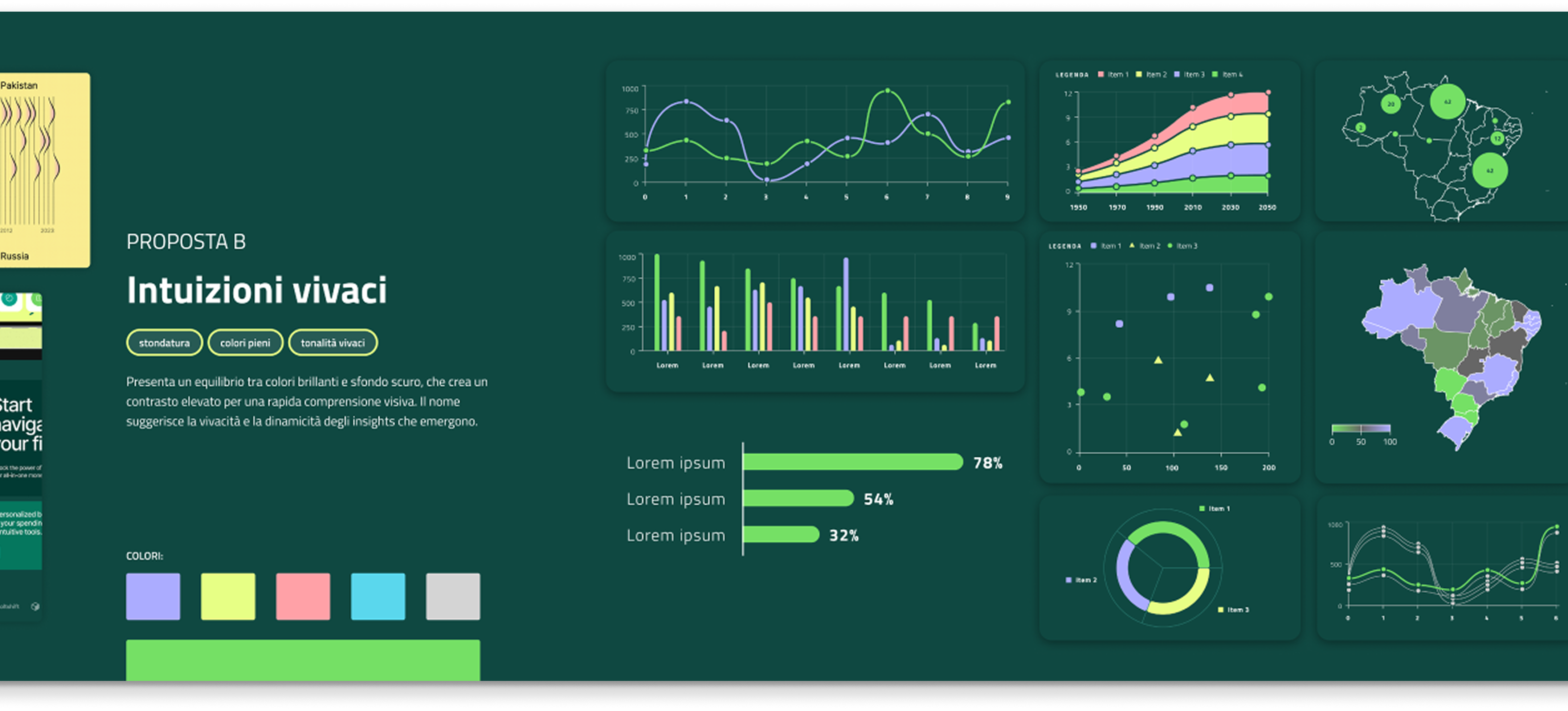
Accessible colour palettes: designed palette ensuring contrast and usability.
Modular guidelines: created a scalable system that adapted to BI tools.
Prototyping and testing: conducted user testing with low-vision and colour-blind individuals to validate accessibility.
The process that guided
Please note: the size of the circles is illustrative, it represents the importance of the phase.The tensions and tradeoffs
There were no established accessibility guidelines for complex charts, so we couldn't just apply a standard checklist, we had to invent the framework. We audited their visual choices, conducted foundational research and at the end even authored a paper on accessible colour palettes, building a custom tool to generate them.
But rigorous research means nothing if people can't use it. Because the system had to be adopted by a big and diverse population, ranging from BI analysts to university students, we had to trade academic density for extreme usability. We synthesised all that complexity in simple best practices, so anyone could implement it.
The outcome
A standardised visual system that brought a clear identity and structural consistency across all departments' reporting. During the test, 89% of colour-blind and low-vision users preferred the redesigned system, citing vastly improved clarity.
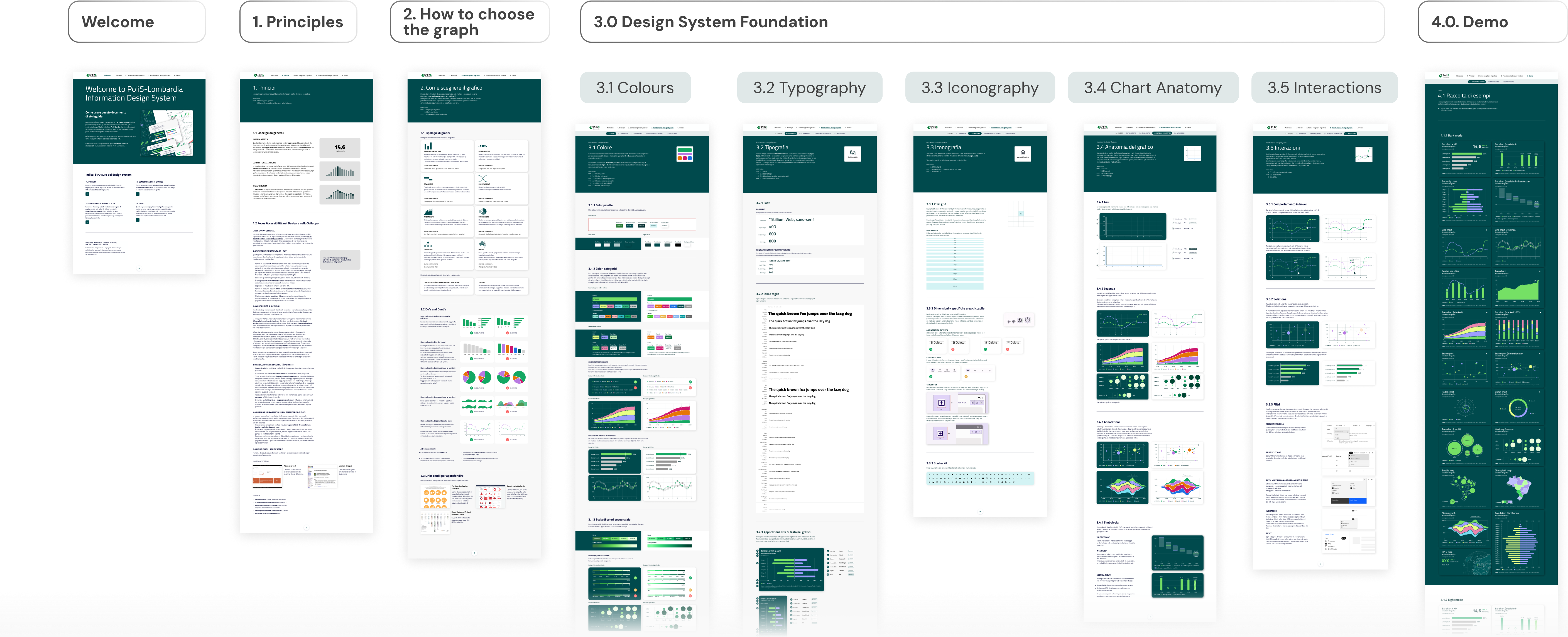
The takeaway: bridging research and practice
A major personal milestone was authoring a research paper on this process (Shaping Accessible Colour Palettes, about to be released). But the real validation came from the testers. Seeing users navigate previously illegible charts with ease proved that accessibility isn't just a technical constraint, but instead is the foundation of good information design.
“Your analysis is extremely valuable and I would like to compliment you on the precision and clarity with which you have addressed an issue that is so relevant to me.”
Alberto, User testerLast update 2026. All data are reserved. I authorize the processing of personal data according to EU Regulation 679/2016.